Sorry for the week of silence but we are officially moved! I thought I’d share our house with you, too. I’ve willingly put my life on the internet for the last 15 years but as I’ve gotten older, had a kid, etc. I’ve been more aware of what I’d like to keep as private as possible. I find myself building more walls around our real life as our online world grows. Our home is actually one of those things, as you’ve seen pieces of our house here and there but never a full layout or full photos of each space. Since the house was quite easy to find locally (we lived in our downtown area and a few specific photos, you’d be able to find it quickly) I wanted to stay as protected as possible. But since we no longer live there, I feel okay now with sharing a few photos of our space! A reverse house tour, if you will, because it no longer looks like this any more. I’ll try my best to source everything from each room, as well. If it’s not listed, it’s because I just couldn’t remember where something was from OR it’s no longer available.
This house was built in 2020 and it has a modern farmhouse aesthetic. We were not the original owners, as we bought the house in 2021. Although the outside is modern farmhouse, the vibe inside to me said California cool. The pure white walls and all of the natural light seemed to fill the space in more than any decor could, so I kept things pretty minimal here. Our last house was more traditional with less natural light and in turn I had more decor and furniture. The best part of this house was all of the light that would flood in. We lived on top of a hill, with a park behind us that has giant, old trees. So in the summer and fall, the light shining through the mature trees at sunset was just majestic. I’ll miss the view and the light, the most. Oh — and the closet. I’ll definitely miss the extra bedroom off of the laundry room that we turned into my closet. I personally think it was meant to be that way.
Entry Way
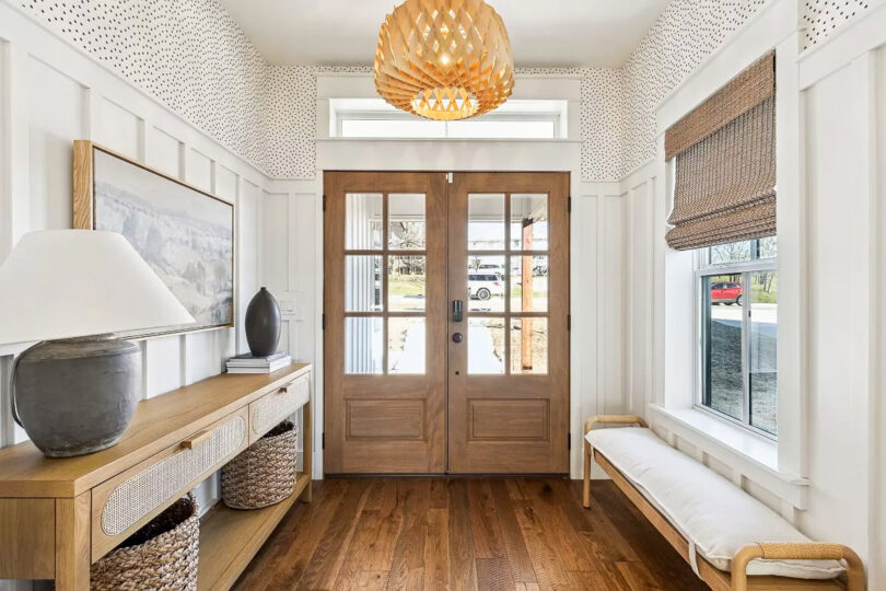
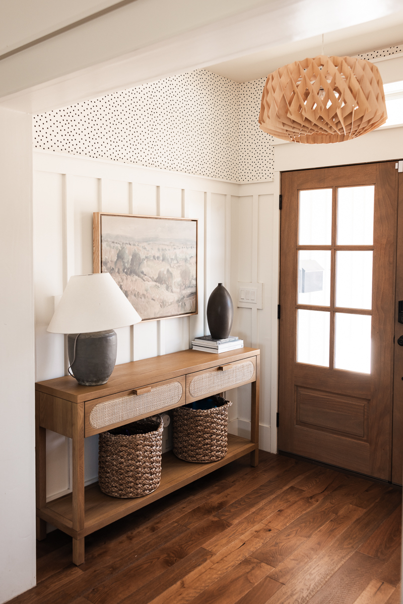
Fun fact — I never plugged in that lamp. I have no idea why. I would like to mention it is now bulbed and plugged in at the new house. The lamp is lamping!
Console Table: Four Hands | Similar Console: Home Depot | Painting: My Texas Home via Walmart | Vase: West Elm (n/a) | Baskets: Target | Lamp: Target (n/a) | Wallpaper: unknown | Bench: Target (Similar)
Kitchen & Dining
The first owners custom built this house, so all of the ‘custom’ features like the wallpaper, the paint colors, the flooring, those were there before us. I feel like we were ahead of our time finding this sage green kitchen, which is all the rage now. (Side note: on the original listing of the house, the kitchen looked teal blue in photos and I think that’s why the house sat for as long as it did. Turns out, it was this gorgeous green all along.) The floors also give a farmhouse nod with their honey oak wide planks, with a few narrow planks mixed in. This gorgeous wood is the only flooring throughout the house. I’ve never had all wood flooring in a house before but we really enjoyed it. And if I can afford it, I’d do it again in a heartbeat.
The only thing I would change about the kitchen if I absolutely had to would be the open shelving. Beautiful, but literally no function if you want to keep it pretty. I would’ve continued on that wall with the same tall cabinets, if it had been up to me. Storage is more important to me than the open shelving. She beautiful, but pointless. Of course, hindsight is 20/20 and the open shelving is what I loved about the kitchen so there you go.
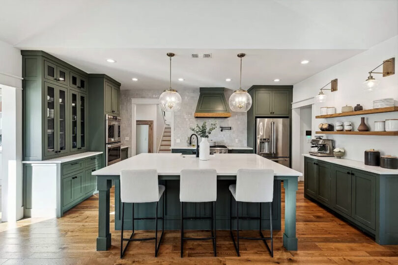
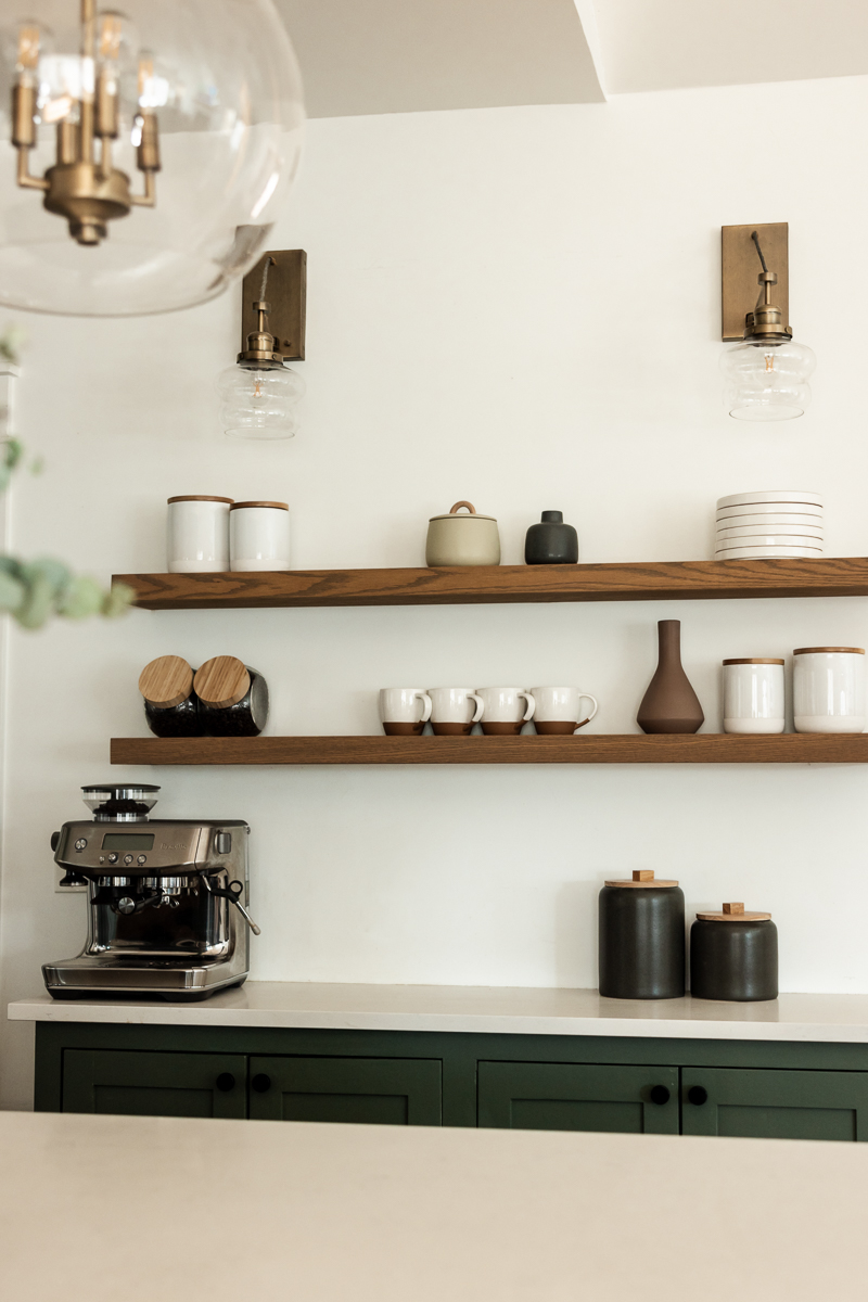
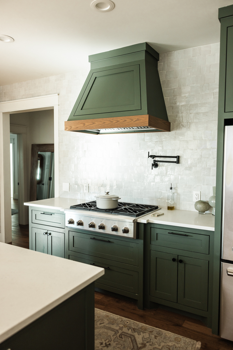
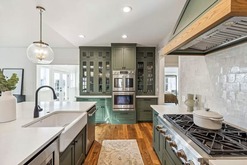
Kitchen cabinet paint: SW Rosemary | Pendant Lights | Backsplash Tile
Counter Barstools: West Elm | Similar Oushak Runner: Etsy | Similar Runner: Ruggable | White Vase: West Elm | Dutch Oven: Walmart | Ceramic Dishes: Amazon | Full resources here!
Our dining room opened up with double doors to our backyard. Unfortunately for us Texans, we don’t have too many days where this is feasible. If it’s not too hot, then it’s allergies, dust, wasp season. If it’s too hot, well it’s just too damn hot. We have issues here in Texas, ok? Nature works against us here.But every once in a while we could pop them open and enjoy some fresh air.
When I saw the built-ins with the light shining in, this room sold me on the whole house. It’s one of my favorite rooms, as you probably know because we would shoot capsules in here, reels, selfies, etc. I knew immediately I wanted to do a symmetrical shelving idea. I couldn’t really find anything to base my idea on, so I just went with what was in my head and found these vases via West Elm. It was a pricey project that I probably wouldn’t do now, but I loved the symmetry of it all. I find that bookcases with too many random items can feel overwhelming and I liked the idea of pattern in here. I brought in a little bit of color with the brown vases but everything else stayed neutral. Oh and I never did decide on a rug here. One of those “I’ll do it later”things that turned into a “never.”
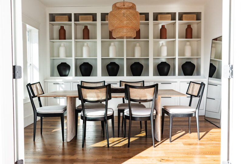
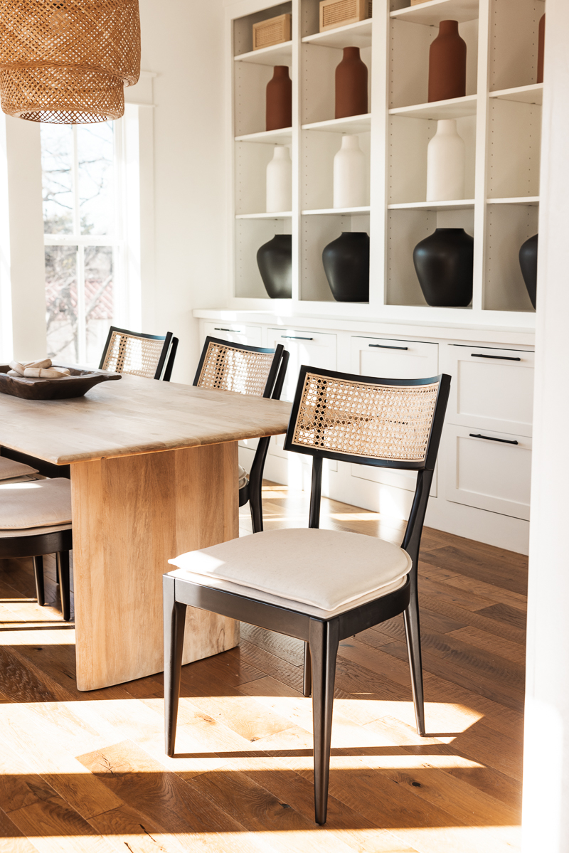
Cane Chairs: Kathy Kuo Home | Dining Room Table: West Elm | Vases: West Elm | Pendant Light: Ikea
Side note: this table is GORGEOUS and sturdy. However, I did not know this but this table is not sealed. Any grease, food, paint, etc that touches it will leave a mark. It is on my long list of anxieties I wore about on a daily basis. We use these silicone placemats, which are ugly but washable, every time we eat here. Gemma still paints, crafts, etc on the table but we just cover the table and my eyes. If you like this table, just be very aware she is high maintenance, doesn’t like butter or kids and only likes to be hand washed with warm water. Probably cries when we enter the room, too, knowing she’s about to be tarnished with our humanness.
Living Room
So this room is gigantic and it ended up being harder to decorate than I thought. We originally had two couches in here and I know this is hard to believe but the didn’t fill the space. This is our only communal area and the two parallel couches weren’t cutting it. We ended up finding this sectional — well part of the sectional — at a West Elm Outlet and I ordered the other side online. It ended up saving us about $2000 once all was said and done, so I do recommend looking at a West Elm Outlet, if you have one nearby. We have loved this sectional, so much. It’s so comfortable and maybe not the coolest or chicest or trendiest couch out there but I can vacuum the pet hair and the kid crumbs off of microfiber cover and that’s good enough for me. Highly recommend this couch, if you are looking. But that’s why the coffee table is a bit small — tis’ not a small table, it’s just a giant room with a 10×10 sectional. Also I already had the coffee table, so it wasn’t going anywhere.
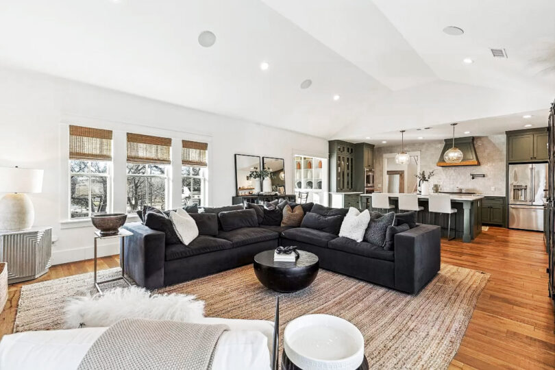
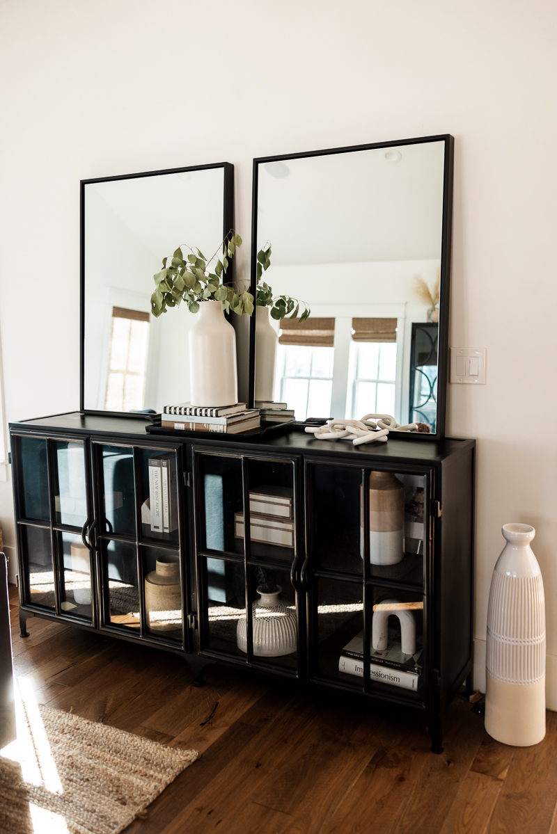
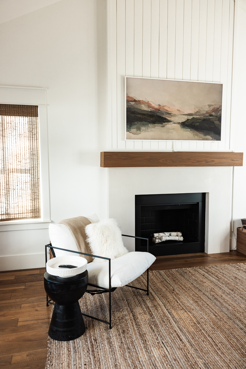
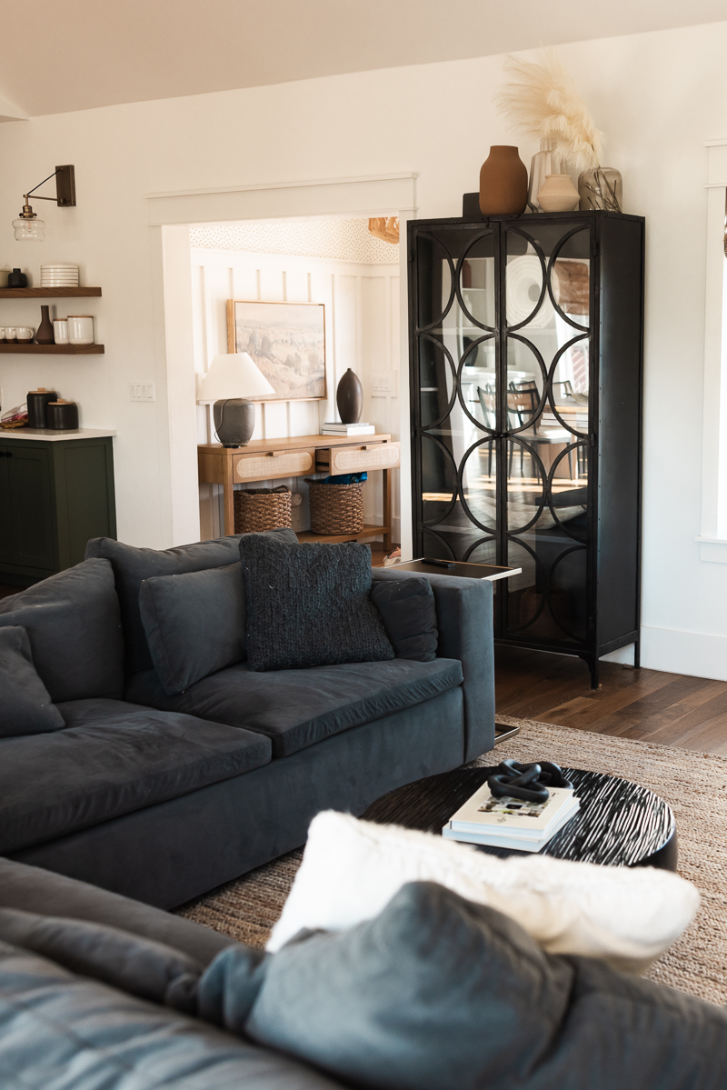
Since the house is so light and bright, I was able to bring in a lot of darker pieces from our traditional house and it felt like a perfect fit. The couch being a dark slate grey balanced out the light walls, too without feeling too heavy. (By the way, we have the sectional in ‘Slate Performance Velvet’ fabric. It’s very nice for kids and pets!)
Sectional: West Elm Harmony Sectional | Chair: Kathy Kuo Home | Coffee Table + Side Table: Kathy Kuo Home | Rug: Amazon — HIGHLY DO NOT RECOMMEND | Tall Metal Cabinet: Dovetail | Metal Sidebar Console: Dovetail | 65″ Frame TV (artwork over the Fireplace) | Black Frame Mirrors: Amazon
Our Bedroom & Bathroom
Do you see all of this crazy light? I’m telling you — it had main character energy. Our bedroom was the last and least decorated. It was usually covered in laundry if I can be really honest. This room would have been great for selfies, but the laundry needed somewhere to rest. I like to give my clean clothes a good 5-7 day rest before I hang them, you know?
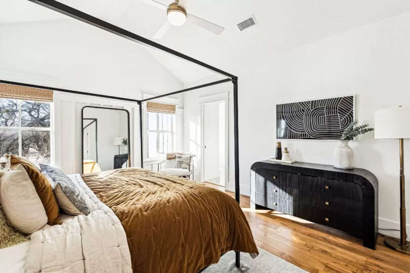
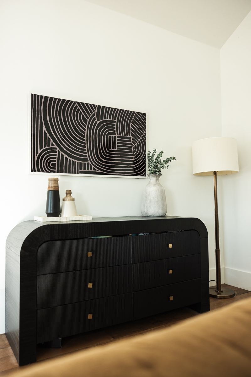
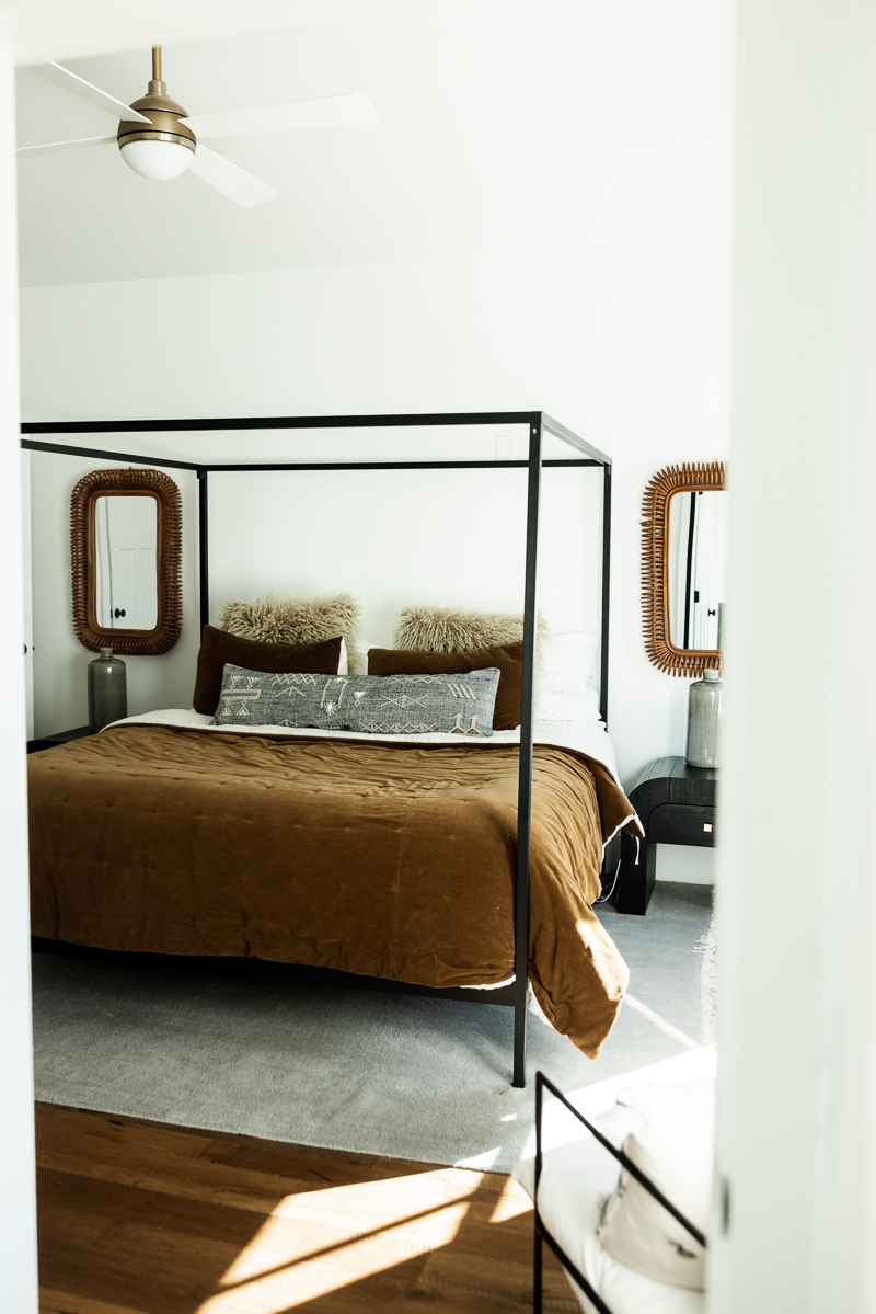
I almost hesitate to share my bedroom because it kind of is an afterthought. I found this bedding on sale and now that I look at it, I thought it was more green but it’s defiantly a harvest gold color. I need to get my eyes checked, maybe.
Metal Canopy Bed: Allmodern | Night stands: Allmodern | Dresser: Allmodern | Bedding: West Elm | Mirrors: Wayfair | Rug: West Elm | Chair: Kathy Kuo Home
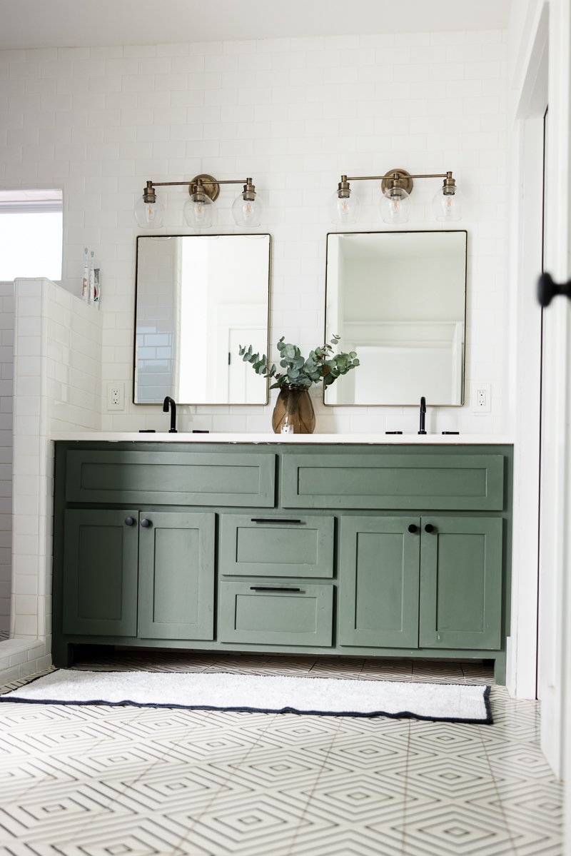
The green cabinetry is carried out through the house from the kitchen to the bathrooms to the laundry room. I found it to be a nice tie in throughout the house. Again, I like symmetry and I can be quite matchy-matchy with my colors in a home, so I liked the tie in to the kitchen. It’s just such a pretty and calming hue and the contrast with the white is just perfect.
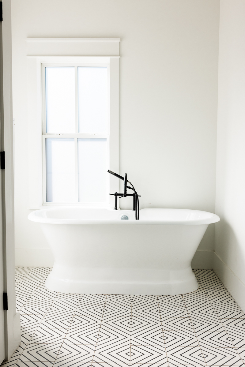
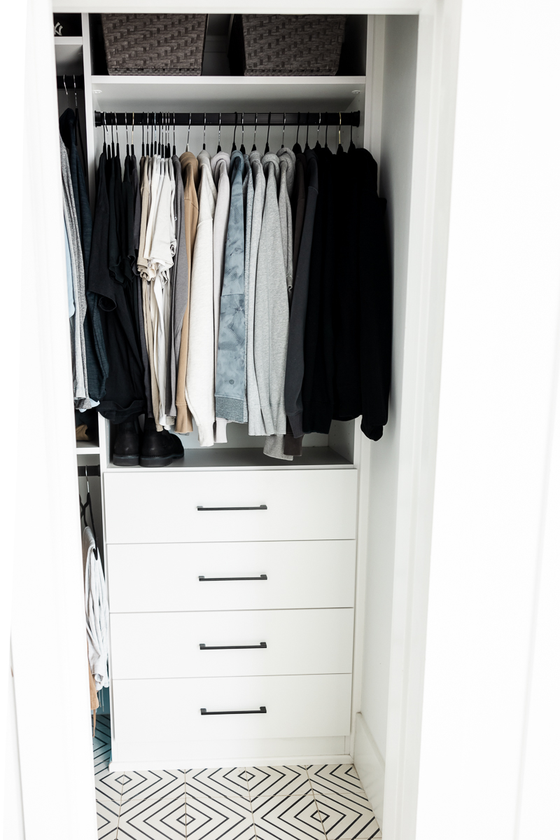
This was the only closet in the bathroom and we had one in primary bedroom but they were both pretty standard size, not really ‘walk in’ closets. We had California Closets redo all of them in 2022 and it was worth it. I would recommend closet design to anyone who is trying to maximize storage in a small space, it’s incredible what they can do. I promise this wasn’t Bryan’s only closet. You’ll understand why I am saying this when you see mine.
The Closet
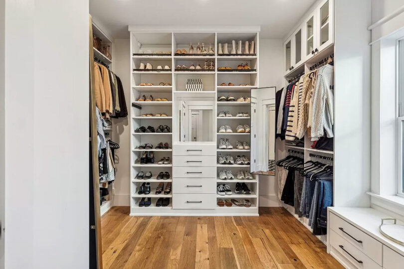
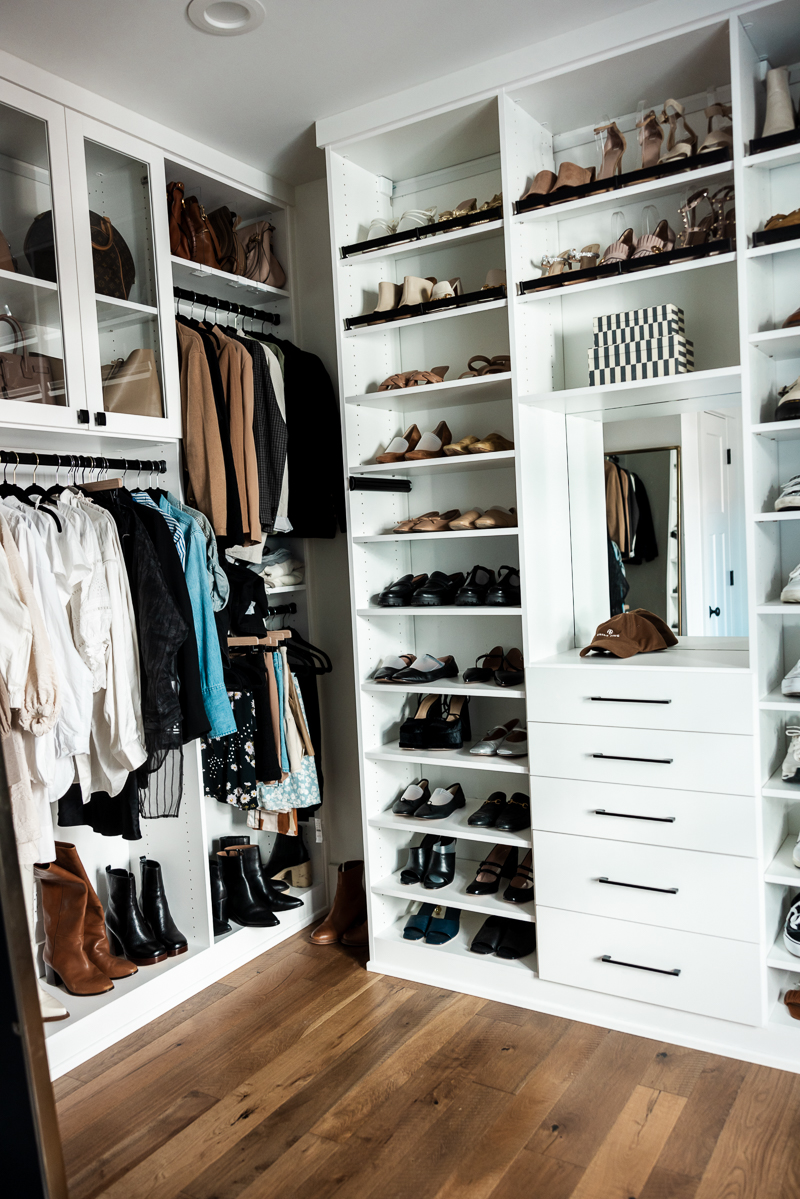
This room was my favorite and I think you can see why. I will say, I wish I would have hung up my clothes a bit more here, as I tended to keep it a bit messy. When I got it shiny and clean for the photos, I thought to myself why didn’t it always look like this!? Hindsight is 50/50 I suppose. I do wish I would have gotten a few more photos before we moved but alas, I did not. This closet was functional, had storage for days and just a dream come true. It was designed by California Closets and I would absolutely do a custom closet again. And for the record, I think any company would be fine to do it. We liked California Closets product and the company in general, but the process was a bit arduous. We chose CC after we had looked into a few other companies, but this design just won me over. I’m gonna miss this storage and space. I like to think I’ve left my mark on this closet. And hopefully a good mark, not like a stain although I make no promises when it comes to stains.
_____
What you didn’t see: Gemma’s bedroom, playroom and our guest bedroom, office. By the time we listed the house, I’d hid a lot of Gemma’s ‘personality’ from her playroom and her bedroom so honestly the photos look sad to be honest. You would think she was a sad beige kid, when she’s actually the “entire LOL doll aisle at Target kid.” About as opposite on the spectrum of sad beige as you can get. We didn’t wallpaper or do anything crazy in her room (she’s requested LOTS OF COLOR in this next house!), so I’d like to re-do her room a bit differently in the new house. Also, it feels weird to share her room / stuff. And our guest bedroom and office were just run of the mill, normal so I didn’t photograph it. Also if the photos are wonky, yours truly took them not our photographer in chief, Bryan. 🙂
We will miss this beautiful home but are also excited for what’s next, too. I truly feel like this house wasn’t mean to be ours forever, I think we were just keeping it warm until the next owners. And kept it warm, we did. This house had lots of laughter, lots of pasta, and whole lot of love in it.











11 Responses
What a beautiful space!
This house is so beautiful, very modern. And with all your decorations it enhances even more. I love everything about it. thank you for sharing.
in love with everything!please do more home decor podts! I have the same dining table and have been looking for cane chairs, but budget-frienDly. Any suggEstions?
HI! YES – I FOUND THREE MORE BUDGET FRIENDLY VERSIONS HERE!
https://BIT.LY/3OZOPFB
https://BIT.LY/3WTMGNF
https://BIT.LY/42QGRED
Your home does not surprise me at all. fits you. serene – welcoming. (im from a realtor)
https://www.fiverr.com/s/PBP2Y0
https://www.fiverr.com/s/zaoP7z
Dear Kendi
The light that shines through your eyes, your soul and your beautiful mature forms, like “La Grande Odalisque” flirting with the golden age of a woman, is simply majestic from sunrise to sunset.
I’m dazzled.
It’s really awesome Downtown Home Tour. its’ look very nice and get clear idea abot itrorior design
Very good content of this article I really appreciate and provide benefits to everyone here
Blissful homE!! Wonderfully thought out and elegant. Thanks for this Post!!