I’m a big believer in moving forward, pushing forward, always looking ahead. This is something I’ve realized about myself in the last 8 years of marriage. I’ve never known myself as a pusher, but my husband has confirmed this of me. He’s s constant, I’m a mover. I don’t know why in the last year this has come as a surprise to me: I started this blog at 25, opened my first store weeks shy of my 27th birthday, I’ve consistently grown both businesses over the last 5 years. I am always moving forward. And now as we’ve relaunched Kendi Everyday I realize that as my life has evolved over those years, I’ve changed, too. I’m 31 now (don’t repeat that), I’ve discover my personal style, I’ve seen more in terms of business experience in the last 5 years than I ever could in 20 years behind a desk. I’ve learned how to handle myself in front of bankers, lawyers, crowds, conferences, critics and those who offer praise. I’ve become a better version of myself than I ever dreamed of. And with that, I knew that Kendi Everyday had to change as well.
Last April I started the search for a designer and began the brainstorming sessions to create what you see today. But this is not the first version of the blog re-design. The first version included soft colors of peach and blues and pinks. It was sweet and soft and…well, dated. It wasn’t true to what I wanted at all. As we were reviewing the final round of edits, I realized that everything I had told Victoria, my amazing and patient designer, was wrong. I actually didn’t love those colors I had said that I did. (Loving a color doesn’t mean you have to paint your whole house that shade, I learned.) I didn’t love the one tried and true blog layout I’ve known for years but was scared to move away from it. What I had envisioned was in fact a tired repetition of what I thought others would want to see. There was not one thing on the design of what I actually wanted. It was not me at all. I was afraid of change, but as I said before I’m a pusher. Change is my motivation. So with knots in my stomach I emailed Victoria, knowing that if she would like to fire me and ban me from the graphics community, I would have to be okay with it. She instead came back on the exact same page and was happy to start again with what I really loved. Except we didn’t start completely over— we kept the logo because I loved it from the get go.
So what you see here is the new Kendi Everyday — it’s fresh, it’s clean, it’s classic. It functions like a site should — you can search for something and actually find it! Find my casual looks and my weekday looks and soon to be my travel outfits on the outfit finder. I wanted something that could grow along with me and my content. I also wanted a format that allowed me to publish multiple or different types of content during the day or the week without it feeling like my other content was lost and abandoned by being stacked on top of each other in an endless scroll. I wanted it to be easily searchable, easy to find what you might be looking for. (There are possibly a few kinks that are working it’s self out, so be patient if you can! I know the RSS feeds are still getting worked out, so let me know if yours isn’t working and we can fix it!) But most of all it’s an exciting introduction of new content I’ve been working on. One of the things I’m excited to share is my business and life verticals — I want to share with you bits and pieces I’ve picked up over the years of owning a shop, closing a shop and the many years of blogging. As well as a few lifestyle and home topics— and yes, a home tour is coming soon. Just let me hang some curtains first. And maybe buy some dining room chairs.
And since the layout has changed, I wanted to guide you through a few things!
Search!
The archive is now actually easy to find and search! You can use the search bar above or use the categories above or the outfit finder. For casual looks, look for weekend, for more dressy looks, look at weekday. Our travels will be in the wherever tab. (We are still indexing a few outfits so hang tight if you reach the end of the archives and you haven’t hit 2009!) You can also read by verticals — style, beauty, shop girl and life to find all the posts you would like to read. Just scroll down a little and a dropdown menu will pop up and you can see more things to click on and read there
Sign Up!
+ You can sign up for a weekly newsletter coming in March! If you scroll a little, you’ll see the newsletter pop up! If you like extra content and a weekly digest of what’s been happening on here, then this is the newsletter for you. You can also follow via Instagram and Pinterest right from this page. Technology is a lovely, lovely thing.
Shop!
+ I have updated shops with a few of my favorite things lately! You can find my constantly curated picks here and my monthly top ten down on the home page. I tried to make it as easy as possible for you to find links or products, if you don’t want to read my daily ramblings. (Somedays I don’t blame you.) You can also shop my Instagrams here.
Share!
+ You can now Pin the images by hovering over the image! Or you can use the nifty little arrow to the side of my post to share on any other social channel you wish to or even email this post to your friends, family, colleagues, strangers, people whose name and email you stole from a random fish bowl of business cards. Your call.
Shazam!
+ Just general amazingness. Can you tell I’m over the moon about this? I moved from Blogger to WordPress and I’ve been stalling to do this for about 3 years. I feel like I’ve been in the stone age and I am just basically amazed at what a little code and elbow grease can do.
I am SO excited to share with you what my everyday looks like filled with thoughts on style, business, home, beauty, and life. Welcome to the new Kendi Everyday.
PS: I can’t say enough good things about Vicoria McGinley who designed this site and helped bring my dream to screen and Lisa Butler who brought this vision to life! Girl bosses at work is an amazing thing.





34 Responses
You styled it so well!I am totally in love with your look.
http://www.newyearsale.co.uk
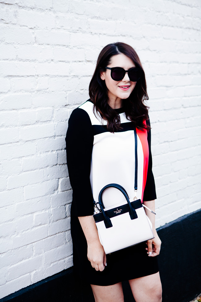
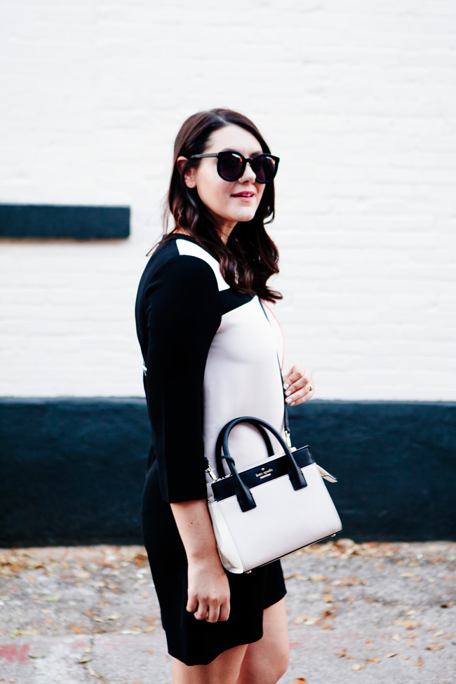
Great achievements, you should be proud! I try to be more of a “now is the time” person. I love the Piet Mondrian like blouse.
http://sunmoonstyle.blogspot.co.at/
Kendi,
It looks amazing. You have worked so hard and should be so proud.
Congratulations! I love the nod to the 60s styling.
Lindsay | http://www.ReadTheThread.com
Your blog is looking great!!
also love this outfit
xx
http://anoddgirl.blogspot.com.au
It’s SO lovely. As a graphic designer myself I really appreciate beautifully clean sites. This is perfect! I don’t comment often, but I really enjoy your style, even though it’s quite different from my own. You always look so polished and put together and present a really classy vibe. Love it! Keep up the great work and congrats on the new site look.
Awesome! I love the new Kendi Everyday:P
Shall We Sasa
I absolutely love the new design and I think that it suits this “new Kendi” much more than the previous one. You’ve come a long way, done a lot, moved forward and this was the natural next step! Congrats on this new Kendi Everyday look and good luck with everything that comes your way in the future. 🙂
http://lartoffashion.com
Well done on the new layout, it looks great and it’s easy to navigate. The outfit is really cute.
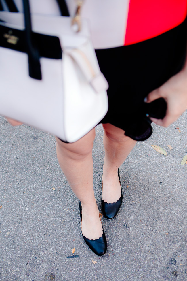
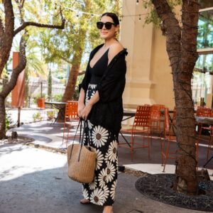
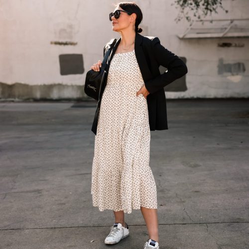
Congratulations! I love how pretty your blog looks. This Kate Spade bag is gorgeous! I love it with your dress and outfit in general.
Yay! How exciting. Your site looks marvelous, and as always, you look phenomenal.
Wow. You really give me hope. I’m 24. I started a really amateur blog on Blogger a while ago. But have erased it because I want to start again, actually invest in a laptop and a camera and do it properly.
It took me a while to come to that decision, but I needed to do what was right for me. I look forward to starting it again, this time, on WordPress and having the right facilities to do so. You’ve come so far over the years and it shows me that it does take time. And I think that’s what we need, to be patient with our success but also make it happen.
Thanks for this post and love the blog.
I can’t wait for the home tour : )
She is really beautiful, and the outfit is perfect for her.
This morning I took the time to look over your new layout and I love it. I enjoyed reading about your process at arriving at this sophisticated layout. I appreciate your honesty & that you stayed true to you. I think that’s often a very hard thing to do, and I’m glad you took a leap of faith. I have been a fan of yours for years—I cannot even remember how I initially stumbled upon your blog, but I have continually been drawn back. Best of luck with the continued changes and progress 🙂 And keep pushin!
Many congratulations! The blog looks beautiful and I am excited to see how you continue to grow 🙂
The new look is so clean and classy. Love it and can’t wait to continue following you into the next chapter!
I’ve been trying to prep for the shift to WordPress as well. Did you do it yourself or contract out? Your blog looks amazing!
Heidi || Wishes & Reality
Bravo! Love the new site, the new vibe, the new outlook, and the original Kendi. You didn’t lose who you are in the process. Congratulations! Can’t wait to tag-along…..
Love the design! It’s very sleek. I’ve been a reader for several years now and I think the look really captures your evolution since you started blogging. Sometime I’d love to see you do a “rewind” post where you look at some of your old outfits and talk about what worked, what didn’t, and how you might do an updated take on the look.
hi kendi! i love the blog redesign; it really does reflect your sophistication 🙂 i was wondering if it is still possible to filter by outfit colors like the olden days. i always loved looking through the color tags to see what you pair with certain colors. you’ve inspired me so much over the years! thanks 🙂
I really love how clean your blog is. It definitely look so good. I didn’t even know that you have a shop? Can you make a post talking about it a little bit, would love to know more of it.
http://dressmecasual.blogspot.com.eg/
I love this, Kendie! And the logo is beautiful! I’ve been a quiet follower of yours and I adore your style and humor, and being so grounded above all..
I am excited to see more of your outfit shots! I hope you incorporate make-up, too and more skin care
Again, congratulations!
The blog design is amazing..you have done a great job!!
P.S I just found about your blog today.. and seriously I’m smitten! Looking forward to seeing all your beautiful and wondering why I i dint come over earlier.
love, jes
baysandflavors.com
Hi, I was wondering why your blog hasn’t been on my Feedly feed lately. Now I know why. The redesign looks great! You’re my fav!
Yes! I’m so sorry we haven’t been able to figure out Feedly’s redirect yet! It looks like the best way is to just re-add me on there! 🙂
AMAZING. the site is absolute perfection just like you!
I love the new website design!
This post just showed up in my RSS reader (Feedly), but now I see it went live awhile ago! I’m a bit late, but I love this new design. It looks very sophisticated and current!
Congrats on the new site! It looks amazing!
I’m another Feedly follower who only just got all your updates 2 days ago, but it looks like it’s keeping up to date now.
I really miss the ability to search archives by month and year… is there still a way to do that, even if it’s not linked to from the homepage?
The site looks amazing, congratulations on your relaunch!
She is really beautiful, and the outfit is perfect for her.